12. 5. 2022
Color choice for offices can improve efficiency, stimulate creativity and boost energy
Colors have an impact on our daily lives and affect not only our mental state, but also the body’s physiological states. The use of color psychology in designing and creating new offices can help employees not only increase their work efficiency and productivity, but also stimulate creativity and allow them to boost their energy and find inner calm. Last but not least, color planning is also important for people with visual impairments, as it facilitates spatial orientation.
Work processes today are so complex that it is difficult to monitor whether a decline or increase in productivity is due to visual stimuli. Nevertheless, there is a consensus among psychologists, designers, and company managers that colorful workplaces tend to increase performance more than workplaces with only neutral colors. "Architects, designers, and employers should take a space’s color layout into account when designing and creating new offices. For example, British researcher Angela Wright’s well-known theory, which describes the relationship between color groups and personality type, can be used," says Jana Vlková, Director of Workplace Advisory at Colliers and adds that the study’s findings are now commonly used to predict customer response to colors in logos, advertising or communications materials.
Fiery colors support creativity and productivity
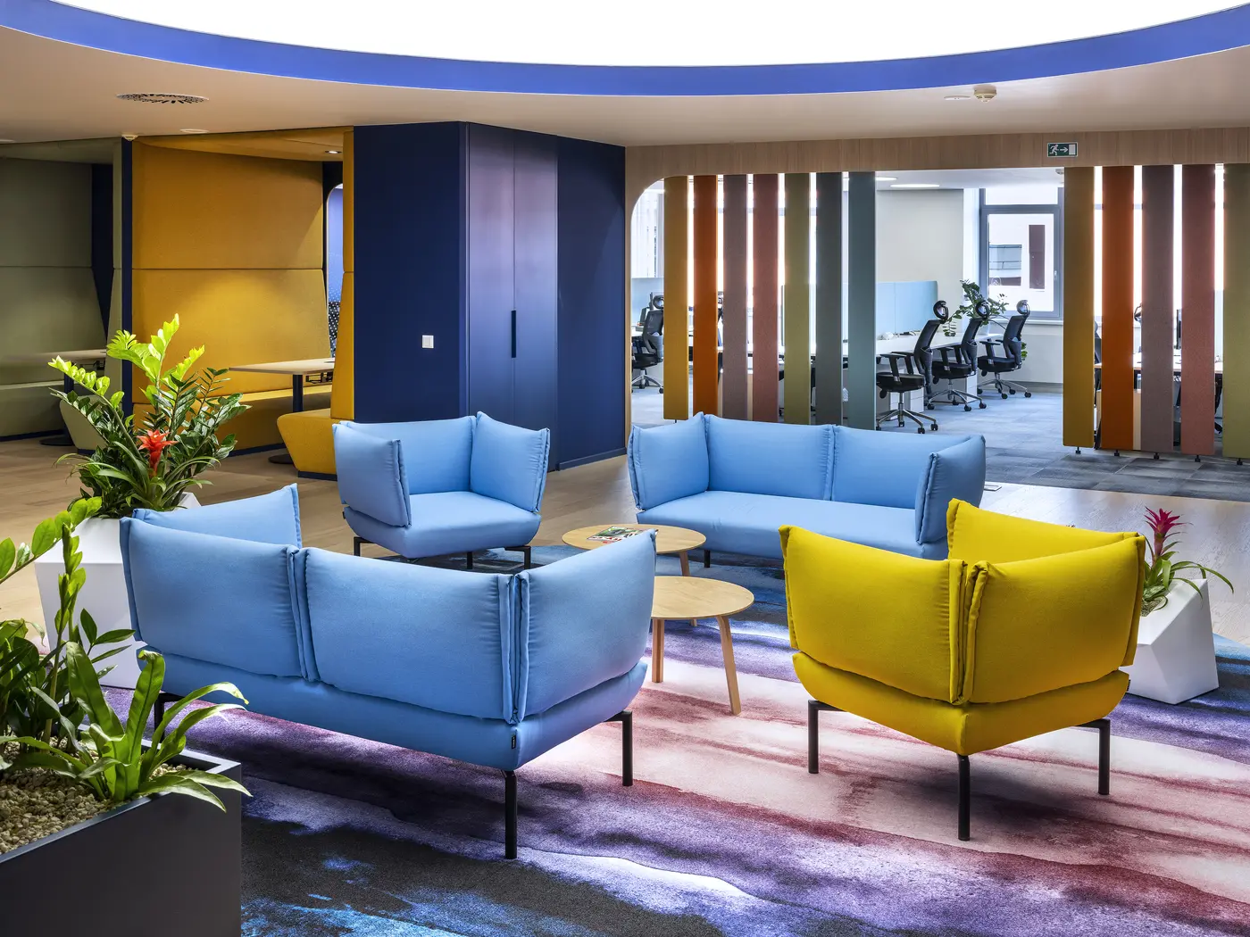
You can support productivity or creativity in the office using several colors. One of them is yellow which supplies energy, improves memory, stimulates thinking, and supports the ability to learn. It also helps people remain attentive which is especially useful for training rooms. However, it is more suitable for larger spaces; in smaller ones it can seem less pleasant and even induce feelings of anxiety. Surprisingly, brown can also enhance productivity. Thanks to its connection with nature, brown evokes a feeling of naturalness and emotional stability. Energy is also clearly supplied by red which increases performance and dynamism. Plus, it strengthens communication and creative thinking. Matching red shades are ideal for meeting rooms, where short-term, maximum concentration is required. However, to achieve the desired effect, it is necessary to combine all the colors mentioned with lighter or neutral tones and adhere to the axiom that sometimes less is more.
Blue and green bring calm and relaxation
According to the study, The Effects of Color in Work Environment, the most popular colors are green and blue. These cold colors, which occur in nature, have mainly calming and relaxing effects. Therefore, they should be present in offices. In business, several companies choose blue for office set-ups: mainly in the technology and finance sectors. In addition to creating peace and reducing stress, blue is also suitable for long-term thinking and for offices with limited exposure to natural light. Similarly, the color green reduces stress in the office environment, while evoking harmony, calming the body and mind, and having a beneficial effect on tired eyes.
Combining is essential
Combinations of cold and warm colors are crucial and have shown a positive impact on the entire teams’ productivity. The same applies to neutral colors such as white, gray, or beige. Although people often consider white to be the least disturbing and most minimalist, the Color and Visual Comfort survey found that workers in purely white offices make more mistakes than those in a colorful environment. Light neutral colors are ideally suited for combination with other bolder shades. However, you do not have to stick to just two colors; you can always add more to your color scheme.
Contrasts for the visually impaired
The right choice of colors is also important for workers with visual impairments. They will especially appreciate visual contrast adjustments. "The color of the floor should contrast with the walls and doors. Furniture colors should also be significantly different from the walls, and for furnishings it is recommended to have contrasting handles with colors different from the furniture itself. For visually-impaired colleagues’ safe movement around the workplace, it is necessary to mark obstacles, glass surfaces, stairs, or various edges. Guiding marks or lines on the floor also help them with orientation," explains Jana Vlková. In cases where a space has a combination of floor coverings, the transition between them should also have a contrast, according to Jana Vlková. Likewise, contrasts should be taken into consideration when choosing furniture so that it is distinguishable from the ground. In the case of glass surfaces, it is recommended to decorate them with contrasting stickers that will help prevent accidental impact with the glass and subsequent injury.